There are multiple methods for signing-up emails to your newsletter such as:
- Adding subscribers emails manually from your existing contacts. This can be good to start however not everyone would be interested in your newsletter and you don’t want to spam people.
- Letting visitors subscribe using a form on your website which is the most effective method for gathering interested subscribers.
- If you operate an online eCommerce store then you can and should add an option somewhere in the checkout process which is a great way to get more emails.
For a newsletter implementation in the website there are have several options.
Newsletter box pop-up
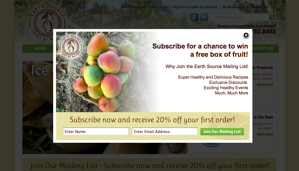
If newsletter subscriptions are very important for your business you may be tempted to consider this method since it attracts attention immediately as someone enters your website. It could be effective but in the same time incredibly annoying for people who just want to find a piece of content. You could lose many visitors this way.
Newsletter link in the website header
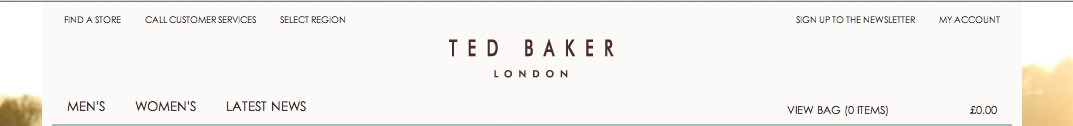
Some websites go with a link in the header such as: “Subscribe to our monthly newsletter” then when clicked the form slides down with a nice animation effect. I do really like this practice however in case subscribing to your newsletter is not a priority you may want to place more important call to actions in the header such as a phone number, social links or for eCommerce websites an Add To Cart button and the regular My account links.
Newsletter in the sidebar
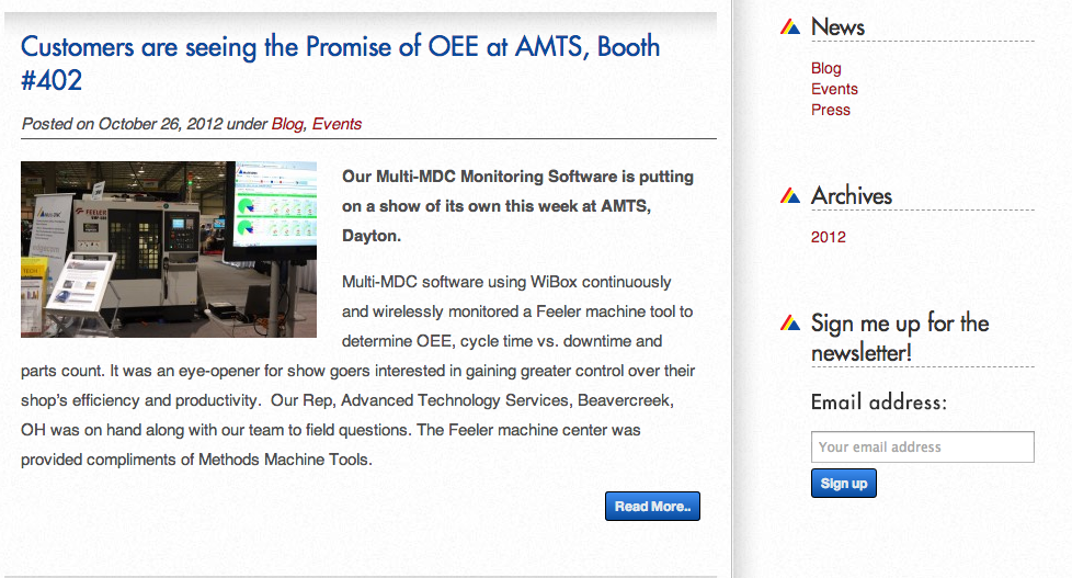
This practice could work great for certain brochure websites or especially blogs. The form would be visible at all times and is higher up on the page drawing a lot of attention. The disadvantage is that if you also have a secondary navigation here and other elements it could be less effective but is definitely cool.
Newsletter revealed from the side
This could be a very non intrusive practice since is not in the user way but it still gets user attention. However I have no data if this method is very effective.
Newsletter linked from home page to a separate page

Some websites choose to have a separate page with the newsletter page and just design a button that takes visitors there. I’m not a big fan of this method since the users have to reload the page in order to go there.
Newsletter form in the website footer
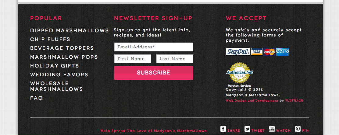
This method is my favorite and also very popular. Most of the users are now used with scrolling and footers are stopping points for many of them and so it is a great place for placing other important call to actions. Displaying a newsletter form here has advantages such as: the form is visible at all times and no clicking is required to reveal it and it’s not in the way and would not annoy visitors who are not interested in subscribing.
Conclusion
There are many options for displaying a newsletter form in your website and depending on the newsletter importance certain practices may work better than others.