Point 7: Don’t follow the trends

Flat design is currently all the rage. Parallax effects, cool but slow, are already so 2013.. Trends come and go however you should always use what makes you unique and relates to your audience. As long as the design is usable and your audience can connect with it, that’s what matters.
Point 6: Never use a cheap design
Your website is your business’ online image. If you want to be taken seriously and generate leads using your website, then a good design is extremely important. If you can’t afford a custom website, there are many templates out there for you to use. A high quality custom website will always be more effective in generating customers, however if you can’t invest in one right now then using a template is much better than using a cheap design done by your neighbor’s nephew.
Point 5: Don’t make your content confusing

I have recently consulted with a client who had an online store for longer then a year, however she never sold anything. I mean absolutely nothing. After I took a look at her website the design could definitely be improved. The home page was packed with motivational quotes but there were no call to action buttons. The take from this is that you should always make it crystal clear what your website is about and what you expect from users.
Point 4: Don’t neglect your website loading speed
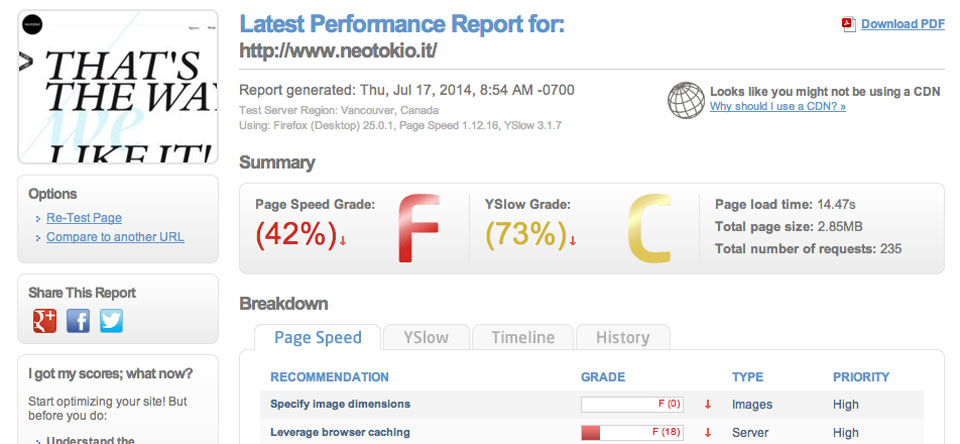
Number one for a slow loading website are un-optimized images. Second is 3rd party scripts such as Sharing tools or using bad quality WordPress plugins. Avoid those at at all cost. On my website, I have gained 1 second in loading speed just by using a minimal amount of 3rd party scripts and plugins.
Here you can find more details about web performance.
Point 3: Don’t reinvent your website navigation
Your website navigation should always be easy to find and use. The order of items in the navigation menu is also important.
If you have a small business that offers various services here’s an example of a menu order that users expect:
Home | About | Services | Blog | Contact
If you own an ecommerce website:
Home | About | Shop | Store Locator | Blog | Contact
- Home page always goes first. In modern practices, clicking the logo takes you to the home page. That’s why the home menu item can be removed.
- About page usually goes second. If you have a team page, you could place it in a drop-down under the about page.
- Services (or Shop) page is generally in the middle of the menu.
- Blog section is generally located before Contact page.
- Contact page should always go last since it is the ultimate call to action.
Point 2: Don’t hide your contact information
If your visitors can’t easily find your contact information, then it’s very likely they will get frustrated. Besides the contact page, I strongly recommend placing a phone number at the top right of the website header, which is proven to increase phone calls. It doesn’t necessarily have to be a phone number. It can be an email or an url to your booking system. Your address and contact info should also be present in the website footer, which makes the website more usable and it’s great for local Search Engine Optimization (SEO).
Additionally you could also implement a “Reach us quickly” contact form in the sidebar.
Point 1: Never stop working on your website

Here are some points you should always work on:
- Update the website content. Always adjust content for staying relevant to your potential customers.
- SEO maintenance. SEO is always changing. What worked last year may penalize you today. Make sure your SEO is up to date.
- Blogging is a great marketing tool that could bring you customers and establish you as an expert in your industry. Blog often, ideally a few times a week.
- Social media. You should always promote your content on social media and interact with your audience. This is great for branding and generating more business.
- Newsletters. Capture email addresses from your customers so you can easily send them updates with industry tips and tricks or promotions.
Conclusion
Avoiding these mistakes can make a real difference from not getting any business from your website to being successful.