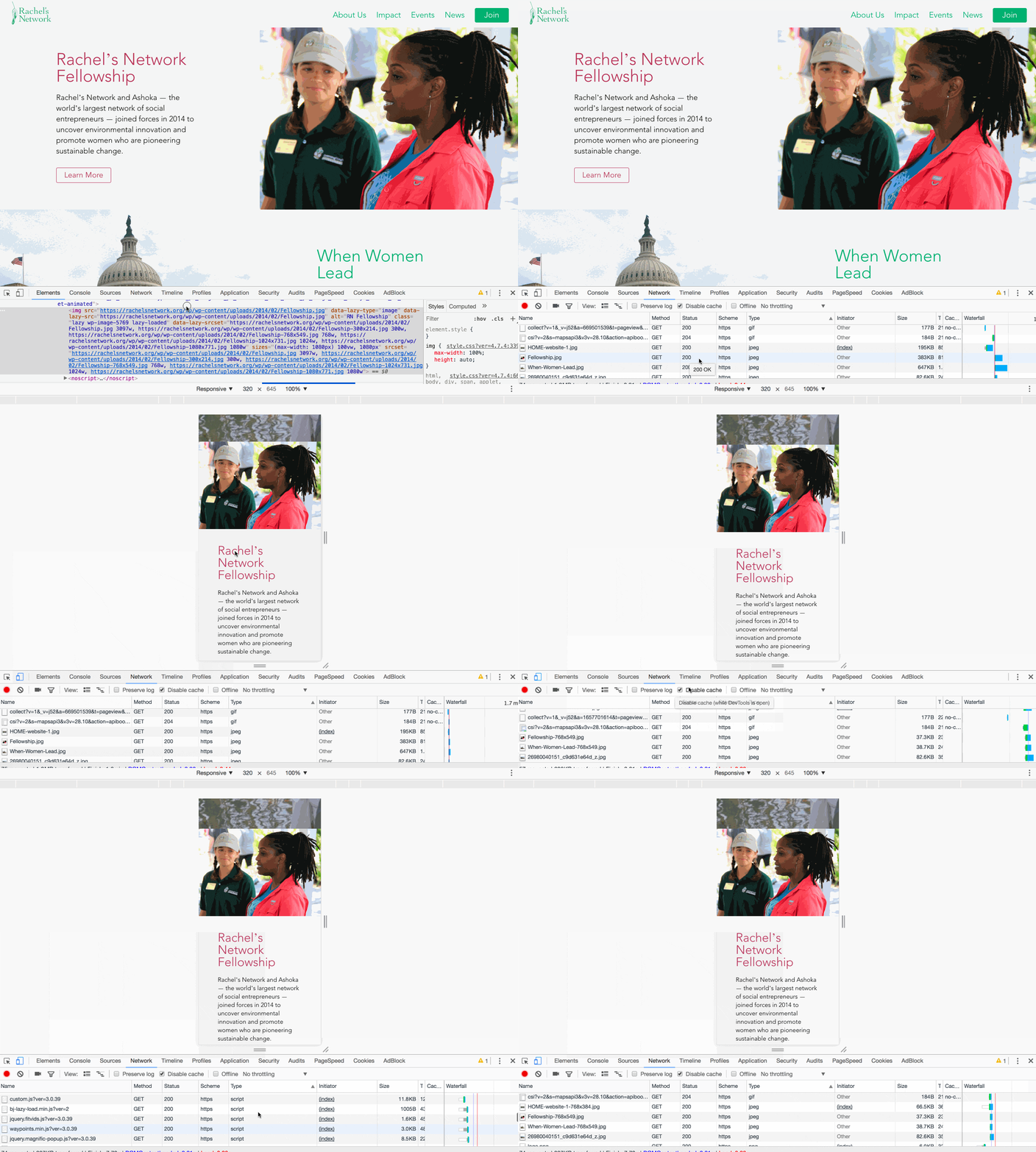
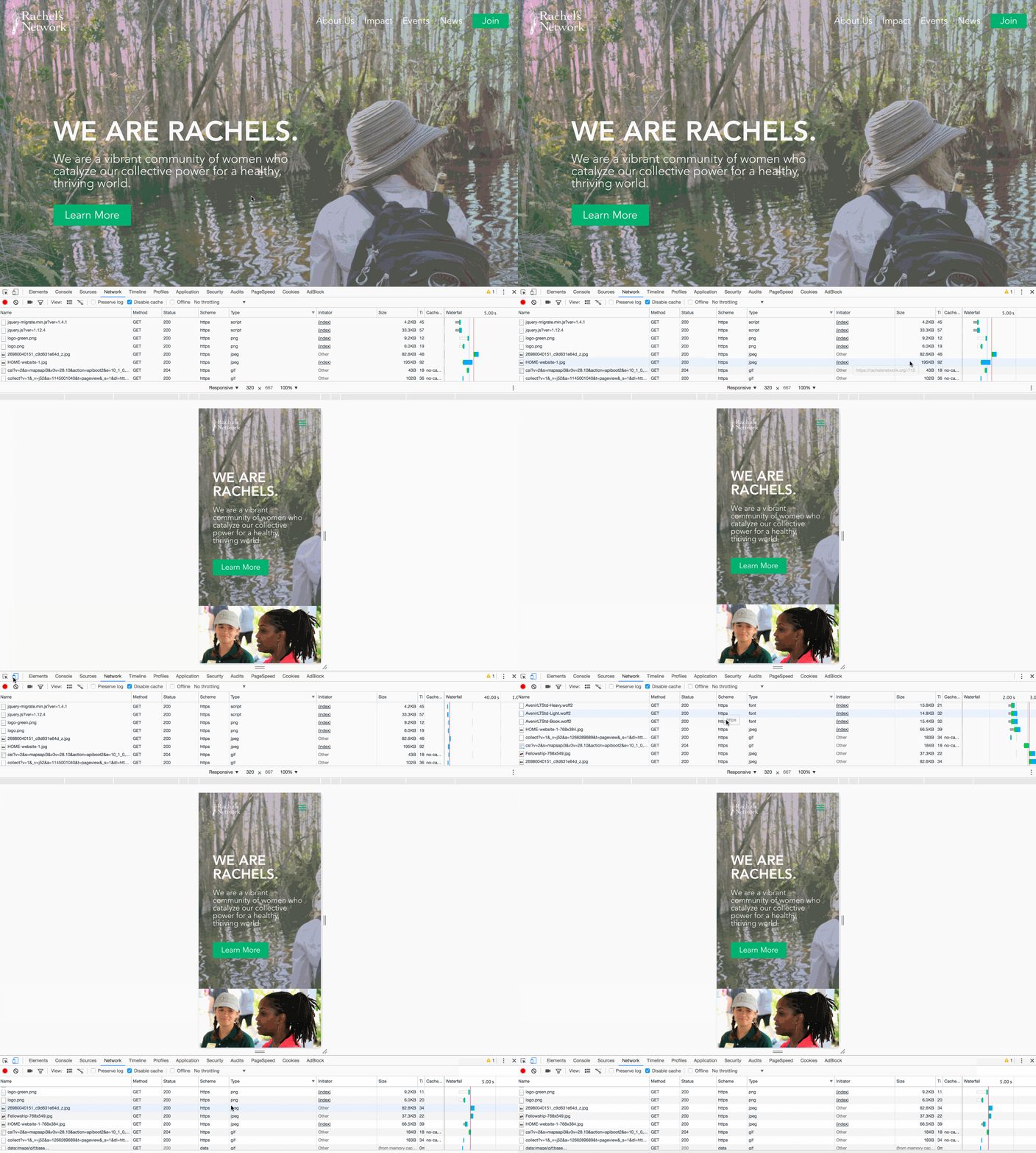
Note: Divi Now supports SRCSET so you no longer need this code.
The downside of visual page builders is that they all have a big limitation. None of them use truly responsive images. Yes, the images adapt to different resolutions but the same 1900px large 2MB image is being loaded on both desktops, tablets, and mobiles. I’ve investigated themes like Divi, Avada and Enfold and they all load the same image size in every scenario. The solution I’m implementing below for Divi theme can be adapted to work with any theme.
WordPress SRCSET and SIZES for Divi Theme
WordPress is already using srcset and sizes for its native editor but Divi builder replaces that functionality with its own. When this happens the image loads the full image. Using the solution below will ensure that responsive, smart cropped, retina ready images are being used. Implement the code below in your functions.php file in your child theme. Please remove the PHP opening/closing tags and enable Divi functions snippet if you already have that file created.
View Solution
How does it work?
1) Content area images

The code identifies all images in the content area and replaces the full URL with the SRCSET.
The image sizes (break points) are the sizes registered by the theme (and WordPress). We have 1080px, 1024px, 768px, 300px, on top the 1440px was added so you’ll need to regenerate thumbnails. For example:
- If browser max-width is 1024px and min-width 769px, use a 1024px image (2048px for “2x” retina).
- If browser max-width is 1440px and min-width 1080px, use a 1440px image (2880px for “2x” retina).
2) The fullwidth header module

This module is heavily used for the intro images. It needed special treatment because it’s setting images as background which are not compatible with the srcset. To solve that we need a different aproach and it’s working as it follows:
For non-retina screen:
- >1440px: use full size image
- 1081px -> 1440px: use 1440px image
- 769px->1080px: use 1080px image
- <=768px: use 768px image
For retina screen:
- >769px: use full size image
- 541px -> 768px: use 1440px image
- <=540px: use 1080px image
Additional notes and suggestions
- You’ll have to regenerate thumbnails. The code above adds a new image size if 1440px.
- Use a plugin like Imsanity to limit the auto crop images to a specified size on upload. Comes in very handy when clients get to populate the content. You can also use a premium plugin such as Imagify which also optimizes the images for web.
- Use a lazy load plugin. I’ve found out that BJ Lazy Load is compatible with Divi but it doesn’t work with my custom solution. The good news is that I have a fix for that too. A lazy load plugin can help your site make very fast and I highly recommend that on every image heavy site.
- The SRCSET solution doesn’t identify the container width. You might want to consider Photon for Jetpack instead. Please note that Photon is renown for adding extra load to the database and their CDN is not very fast. If you also size up the browser the image won’t scale properly.
- Another solution would be to delegate this to a CDN. ImageEngine has a free plan and a WordPress plugin. I haven’t tested this yet but it looks promising for smaller sites.
