I have worked really hard in the past 3 months to launch my new website. The entire project was a collaborated effort between a content strategist/copyrighter for providing the copy and advising on the website structure; one of my design partners for creating a simple visual interface with a touch of artistry; a professional photographer who took some great photos of me; and the undersigned for development and project management. The time I have invested in the project was 100+ hours while the team combined time was 160+ hours and I still can’t say the website is completed. Actually a website is never completed and it needs to be constantly tweaked and improved in order to remain effective.
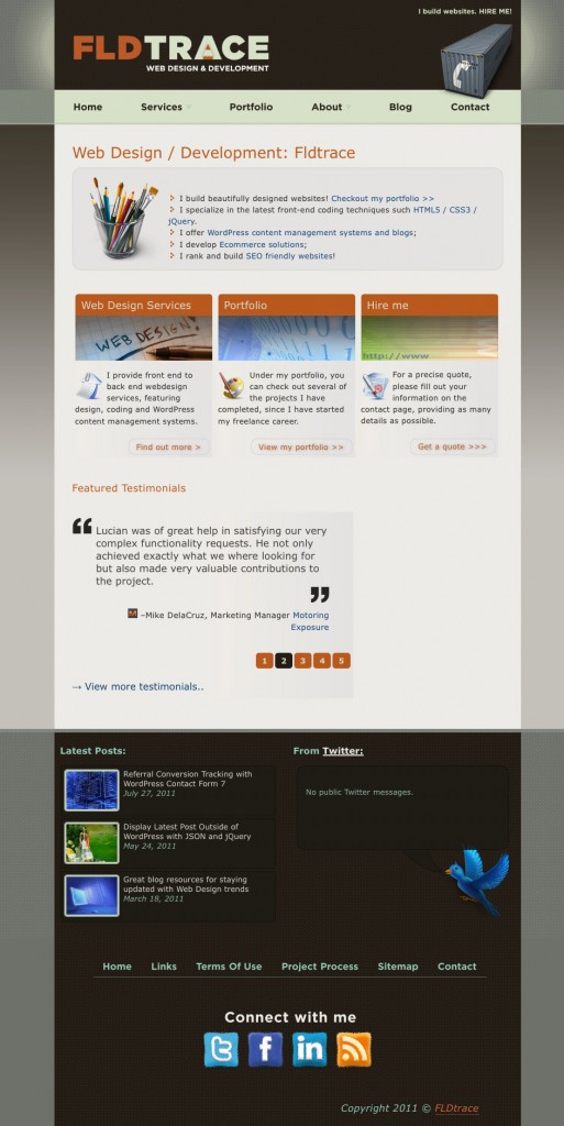
The old design
You can see in the screenshot below my old website design. The website colors use the same base however they were refreshed a bit so they give a more vibrant vibe. The layout for the old website was fixed and not optimized for all screens however now I have implemented RWD (responsive web design) where the layout adjusts to all screen resolutions small or large.
The entire process
You can read more below about the steps I took in creating the website and the logistics behind the design decisions.
Content first
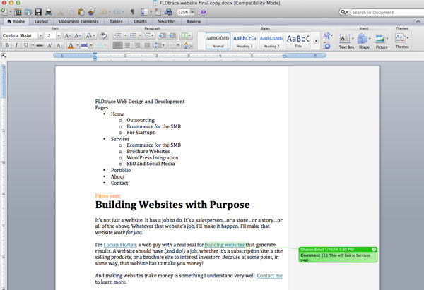
It’s easy to forget that we build websites for an audience who are visiting our website to find out more information. We can keep the users engaged longer by providing high quality content and a clear message which leads to higher conversions. With some help from my content strategist I managed to restructure my services and connect with my ideal clients which are Design or Marketing Agencies, Small to Medium Businesses and Start-ups. The services I offer for this clients are straight forward: ecommerce, brochure websites, WordPress integration, SEO and social media.
Design stage
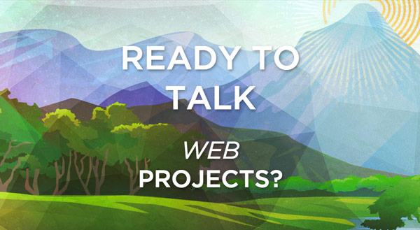
After the content was figured out the next stage was the design part. I have put together some wireframes and with big help from my design partner we managed to come up with a simple and intuitive layout with call to action messages that lead visitors to my portfolio, services and ultimately to contact page. We decided that flat design with simple colors, no shadows or patterns provides a modern look while the content remains easy to read without unnecessary distractions. However I wanted to have something more than just a simple interface, something that can make me stand out among my competitors, then my designer came up with the custom made top graphics that you can see on all the main pages. I was always a fan of animated and alive designs and I am very happy with the results. I feel that my website doesn’t represent me only as a web designer but it represents me as who I am as well.
On larger resolutions you can also notice that the body text is much larger then what you see on other websites. Users with larger screens prefer larger text. Besides that, the optimal reading rate is between 45-75 characters per line so I have increased the text accordingly.
Responsive Web Design (RWD)
The next step was to code design using HTML, CSS and jQuery while taking advantage of the media queries to make it responsive. This stage is where I have spent most of the time. I basically had to provide different design concepts for different resolutions. It took a lot of testing and effort to get it right. As you can read more below I had to keep in mind things like performance and a clear headline hierarchy for usability and SEO.
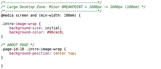
For the media queries I went with a mobile first approach and have decided to use em based breakpoints. The reason is that this type of layout holds better in case the users are zooming in, opposed to pixel based queries.
WordPress for back-end
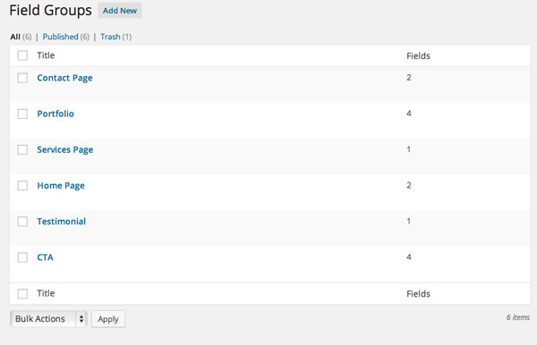
I started working with WordPress many years ago, my old website and blog were built on the same platform so WordPress was the logical choice for the content management. I decided to go with a fresh install since the old website database became very messy. After I coded most of the website locally I created a custom WordPress theme where I added more pages and tweaked everything as needed.
I have tried to use only quality plugins that don’t bloat the front-end with unnecessary resources use techniques to keep everything load fast.
Performance
Another goal was to make everything load in under <1 second. The reason is that fast websites keep visitors on the website longer and increase the conversion rates. I managed to achieve ~0.86ms – 1s using certain techniques that I will describe in a another post. Depending on your location this speed may vary however that will be fixed soon with using a CDN.


Usability
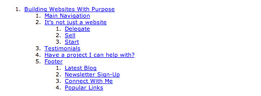
I invested some time in making the content structure easy to follow for all readers including persons with disabilities using schema.org code snippets and correct headline indentation. You can use this document outline tool to view how someone with a screen reader would see the content.
Tools I have used
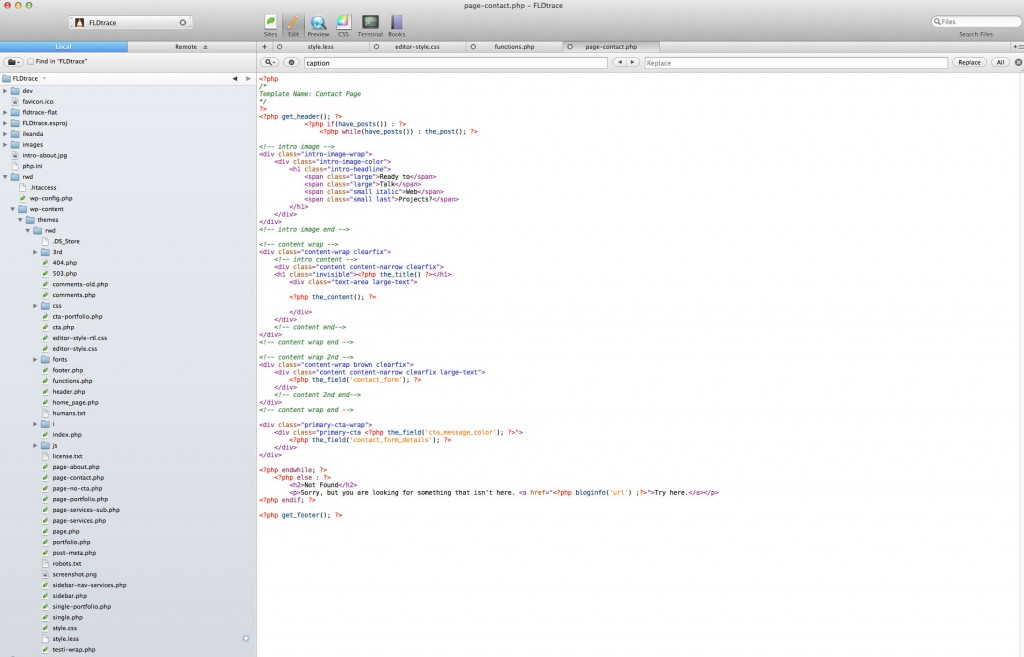
The tools I used in building this website were my iMac, Coda (v1) and LESS and Photoshop CS5. Some users like Sublime Text for code editing and Sass which are great tools if not better. The more geeky front-end developers also use Github for backing up their projects however I have never seen the need for any of those in my workflow.
Final thoughts
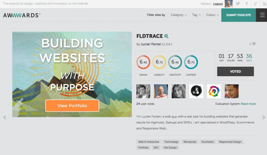
Creating a high quality website, from content, design, responsiveness to WordPress integration and high performance takes a great deal of knowledge and effort however it is very rewarding. At the moment of writing this article my website was featured on several CSS and Responsive showcases including Responsive Showcase and it was nominated for Awwwards site of the day which I’m very proud of. Just getting approved in Awwwards is incredibly difficult so that’s an accomplishment in itself especially my website is built for my audience not for other designers.
