Top reasons why you shouldn’t use a slideshow
- Slideshows don’t get enough interaction from users! Case studies show that the first slide gets the most action about 70%-80% of clicks while the second slide gets less then 13%. The percentage gets lower for consecutive slides.
- A slideshow slows down the website. As I have mentioned in my previous post regarding performance, image heavy slideshows impact the users’ experience negatively.
- Slideshows can be confusing if not implemented properly.
Better slideshow alternatives
Simple static image

A better solution is to use a static image. Many brands moved to using static images e.g Apple, Forever 21, etsy.com etc. The static front image is more effective because:
- It is easy to understand. You only have one slide with one call to action button.
- Offers better performance. One image loads faster than a slideshow with several images.
- It is less distracting. One static image keeps the user’s attention focused on the main message.
If you own a start-up or a small business website, then you can direct users to your services page where they can learn more about how you can help them. If you operate an ecommerce website, you could point them to the products page. Alternatively you can rotate a static image throughout the year that can showcase your seasonal products. That image points to a specific category in your shop.
Multiple static images

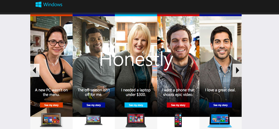
If you absolutely need to advertise multiple blocks of content, then you can combine multiple static images where each image points to a different part of the website. You can see this technique on websites such as GameSpot, Gap (there is an image slideshow but the text is stationary) or Kay Jewelers.
When to use a slideshow
There are scenarios where a home page slideshow can be useful if:
- You are a company where branding is more important than users clicking on a slide
- You want to look cool even though this may not be the best for your visitors or bring you more business
- You need to keep different departments from your company happy by showcasing all the content.
How to make a slideshow usable
Slideshows are not likely to go away any time soon. It’s very likely that you’re already using one. Here are some best practices for implementing a slideshow:
- Don’t set it on auto play. Users like having control over the interface and it gets confusing when the images start rolling automatically.
- Don’t use more then 3-4 slides. As I have mentioned above, nobody bothers to click to see all the images and too many images slow down the website.
- Use clear navigation. Small bullets typically used in the slideshow navigation are not the best indicator for showing where the user is in the slideshow. Use thumbnails where possible and navigational arrows should have next/prev text attached to them.
- Add gestural hints for touch enabled devices
Conclusion
Slideshows are a poor way of presenting content. Unless you use it, for branding purposes then you’re better off using a simple static image. This not only makes your website load faster but it’s less confusing and generates more clicks.
Please comment in case you found this article useful.