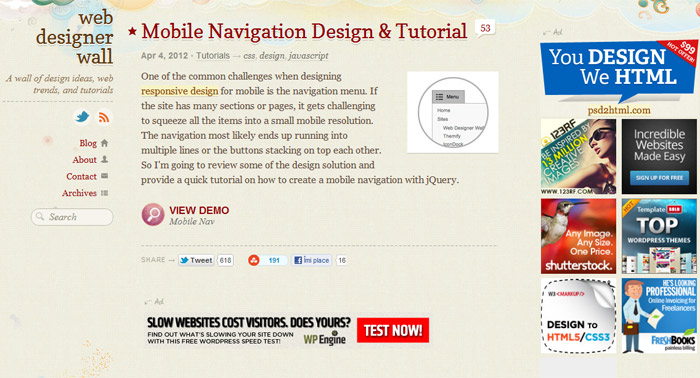
For easier development using media queries, we have to transform the fixed sized layout to a fluid one which will take advantage of percentages instead of pixels and as a result the layout will always shrink and grow based on the browser size or display resolution. The font size will also be specified in em’s (similar with %) so it will zoom automatically.
CSS3 Media Queries enable us to use conditionals depending on resolution. For example we can specify something like this: if browser’s width is 480px or smaller than hide sidebar and/or make the navigation horizontal.
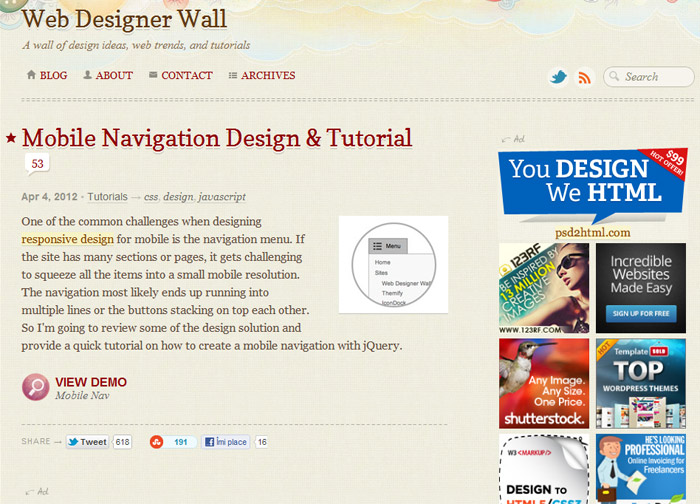
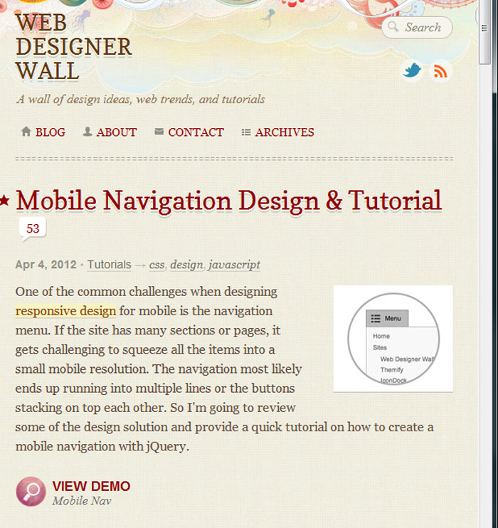
Please see below how the next website behaves when it’s viewed at different browsers widths or resolutions: http://webdesignerwall.com/
Large resolutions

Medium resolutions or iPads (tablets)

Small resolutions or iPhones (smarthpones)

Responsive Design and Media Queries Advantages
- You can serve only the most important content for smaller resolutions such as iPhones, thus eliminating clutter
- Higher chances that the website will lead to more conversions (better selling of products or services)
- If a significant portion of your audience are using mobile devices, a responsive website makes sense.
Responsive Design and Media Queries Disadvantages
- Responsive websites take longer to code and are more expensive
- Those who expect the same pixel perfect layout for each resolution will be disappointed. However, this could be an advantage in certain cases
- Before investing in this option I recommend checking the analytics. If most of the visitors are using 1024px resolutions and up, an responsive solution wouldn’t make sense
- The requirement is to always build first the Mobile version than customize it for larger resolutions.
Older browsers don’t support CSS3 media queries but there is a Javascript fallback. However a very small percentage of users, who don’t have Javascript enabled, will be forced to see the website version target for mobiles. - Most of fixed websites show up reasonable well on smaller devices.
- Some non-tech clients wouldn’t understand why their website doesn’t shows on the phone the same like on desktop.
Conclusion
Responsive designs would not always benefit all website owners and investing extra in this feature does not makes sense in all cases. However, certain business owners can greatly improve the browsing experience of their users. If a significant percentage of the visitors are browsing using mobile devices, providing them with an easier way to access the content could lead to higher profits.

Considering the exponential growth of mobile use, unless you want to completely redesign your site in the next year or two, it would seem to make sense to me to at least keep it in mind and create your HTML framework in such a way that, even if you don’t utilize media queries right now, the basic structure of the site itself would be modular/adaptable to device-adaptive rearrangement if you decide to add that functionality later.
I agree Rachel. That’s a good observation.
I read somewhere recently, that in just a couple more years, industry experts (whoever they are) are saying about 30% of traffic is likely to come from mobile devices. In my mind, that includes the tablet style devices… and judging by the number of these devices i am seeing around lately, i have to agree. They are more convenient for on the go, and casual web surfing. For the average user seeking some quick info from their smartphone .. sometimes whipping out that phone and saying “Why are rivers green in color and some are blue in color”… they mind have their best answer coming from the first… just convenient to quickly get info…
Last time i checked… people want easy to use websites. Smartphones can only go so far in usability.. so the webmaster must make a good attempt to mitigate some of the UI challenges. A good webmaster will be up front with their clients when designing a site let them know it’d be to their advantage to make a mobile template or at least use a responsive design.
After several years doing things the hard way, i moved into the world of Zurb’s Foundation CSS and jQuery framework. It’s pretty light, and it’s very nice out of the box. However, you’ll still want to do a bit of testing and tweaking your website’s overall look and feel.
Those who build websites using WordPress will be happy to hear that responsive designs using Zurb Foundation “Google Zurb Foundation WordPress” and you’ll come across one or two decent almost ready version out there… free. Just adapt it a bit here and there and you’ll have something that is nice to use on mobile phones, tablets and desktops and cross browser compliant, HTML5 ready and rock solid to work with. You’ll never go back.